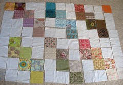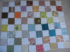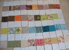
Today Ellen (my 13 year old daughter) and I were playing around with the 4o squares that I received from Art Gallery Fabrics last month, and we were trying to come up with a design for a lap top. The 40 squares represent an assortment of Patricia Bravo's designs. The fabrics are just beautiful.
I don't know--what do you think--which layout do you like best? Or do you have suggestions for something different? Maybe I should cut each block in half and try something new? The blocks are each 6.5" square, and I really don't want to add in any other prints. Perhaps instead of a quilt I should make a patchwork bag--decisions, decisions....
Ruth


I say go for a patchwork bag. It's a quick project and you can enjoy your fabrics all the time while using your bag.
ReplyDeleteHave you seen the patchwork pillows that Alicia at Posie gets Cozy is currently making? They are so fun! She also has a great way of sewing the patchwork squares together. I am planning on making some pillows soon!
ReplyDeleteI like the last layout the best for a quilt, very cute.
ReplyDeleteI like the first layout, but maybe put the squares in color order for a smooth, rainbow effect.
ReplyDeleteI prefer the first layout. But I would like to see either the squares cut in half on the diagonal, or better yet, I would love to see you do a rag quilt. You can see a picture of one on Xue's blog, http://xue-originals.blogspot.com/ . You can Google "rag quilts" to find out how to do this.
ReplyDeleteRegards,
Trudy,
www.sewingwithtrudy.blogspot.com
I like the first layout!
ReplyDeleteI like the middle one
ReplyDeleteI like the first layout the best. But a bag sounds great too. Or even a piece of clothing..
ReplyDeleteSo many possibilities with such lovely fabrics!
The row layout, last picture, is the best to really make the fabric pop.
ReplyDeleteI like the first layout better.
ReplyDeleteI really like the top choice.
ReplyDeletei like the 3rd example, perhaps you could distract it by adding 2 more rows of white between the 2nd and the 3rd line. but with these busy prints i think this simple design works very good. happy crafting.
ReplyDelete